Luma Mufleh Case Study
Personal Website
Starting Point
The
Branding
Process
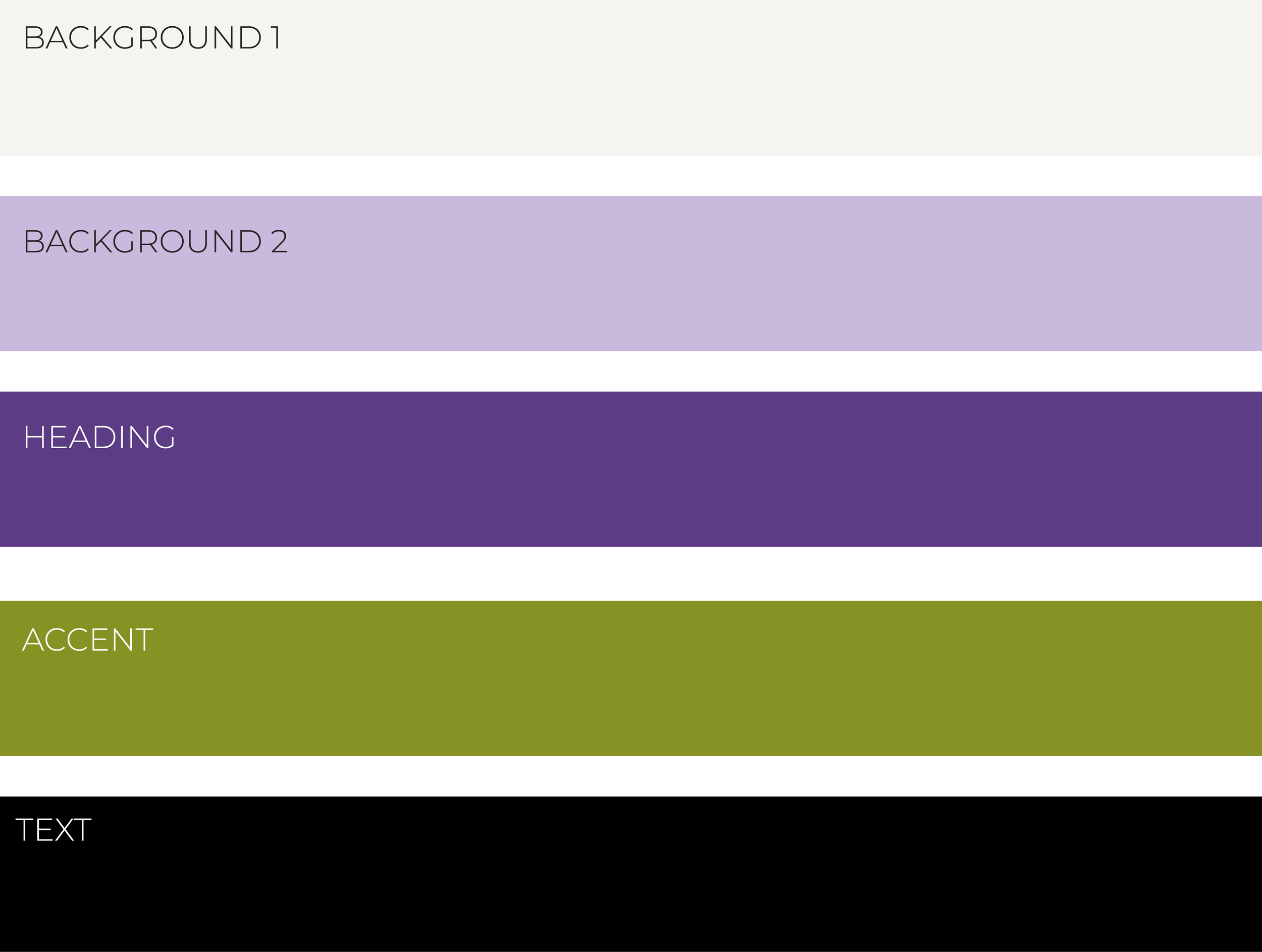
The purple colors in this palette correlate with both of Luma’s books. The light purple is matched to “FROM HERE” while the deeper purple represents “LEARNING AMERICA”. The green accent color ties in the Dark green and yellow brand colors of the Fugees. It is used in areas where I would like to draw extra attention throughout the site.
Problem
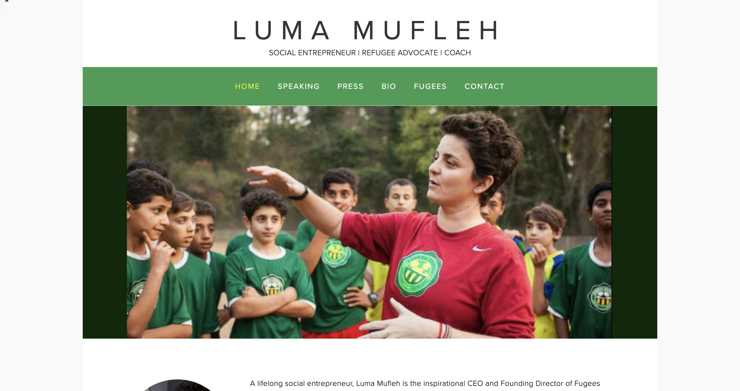
The website was in need of a redesign because it was outdated and lacked a personal touch. It needed a brand identity attached to it as well as a different navigation points to better market the clients books and speaking presence.
Solution
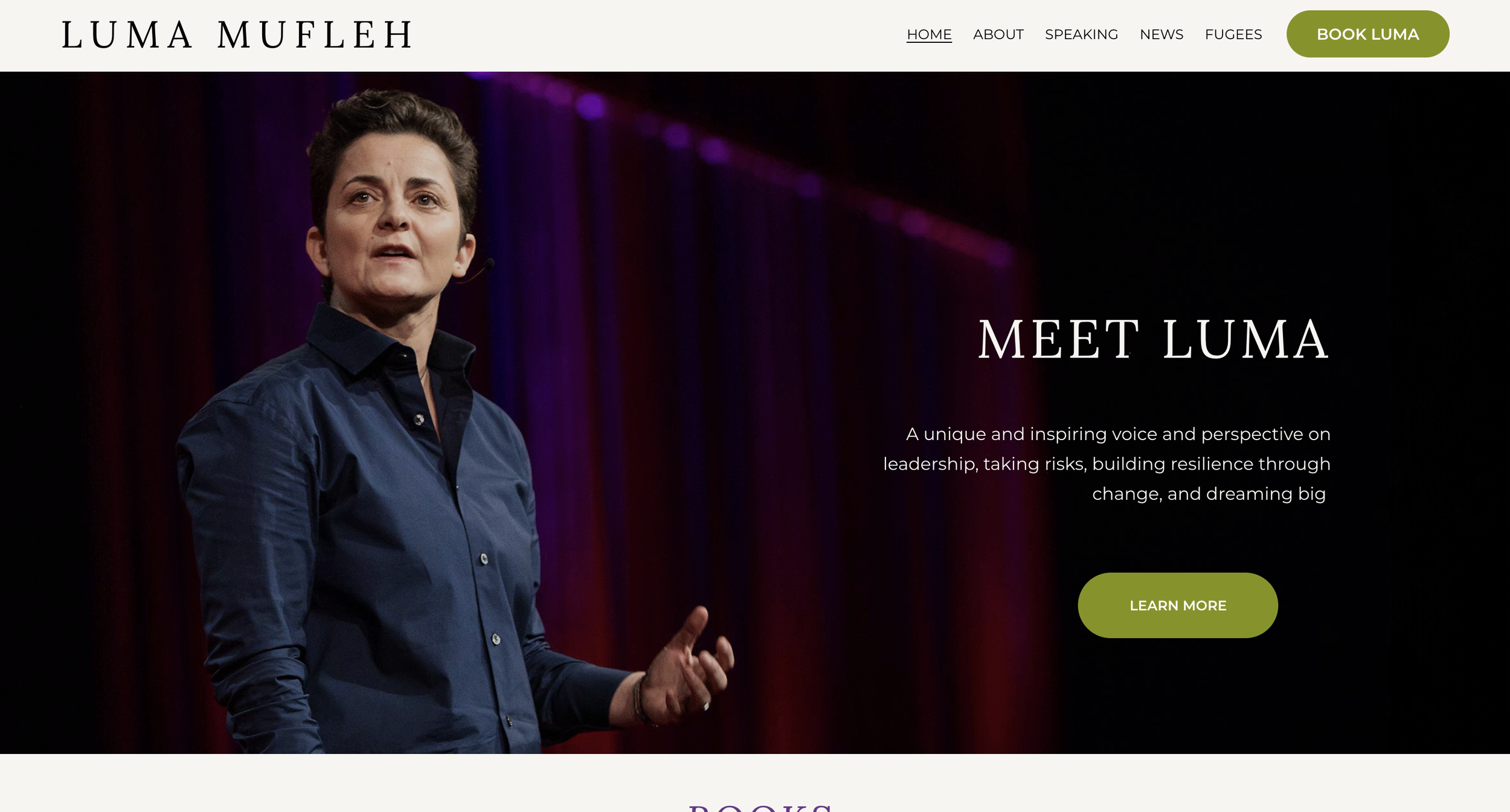
To solve this issue, I created a site color palette incorporating purples and greens, which align with the client's book cover and company colors. I also met with a writer to redo navigation points and sectioning and created a more modern structure for the site design.
Site Goals
Highlight Luma’s speaking
Advertise books
Showcase career
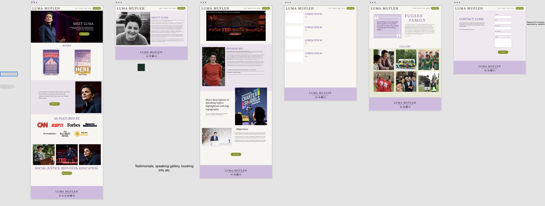
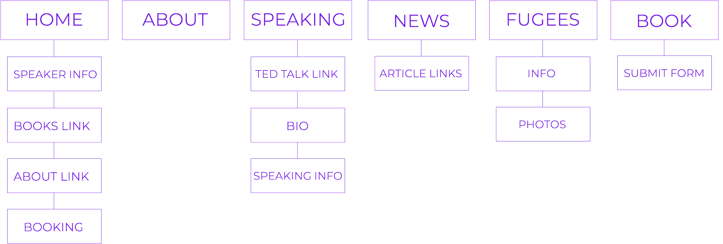
Information Architecture
Wireframes